Composition
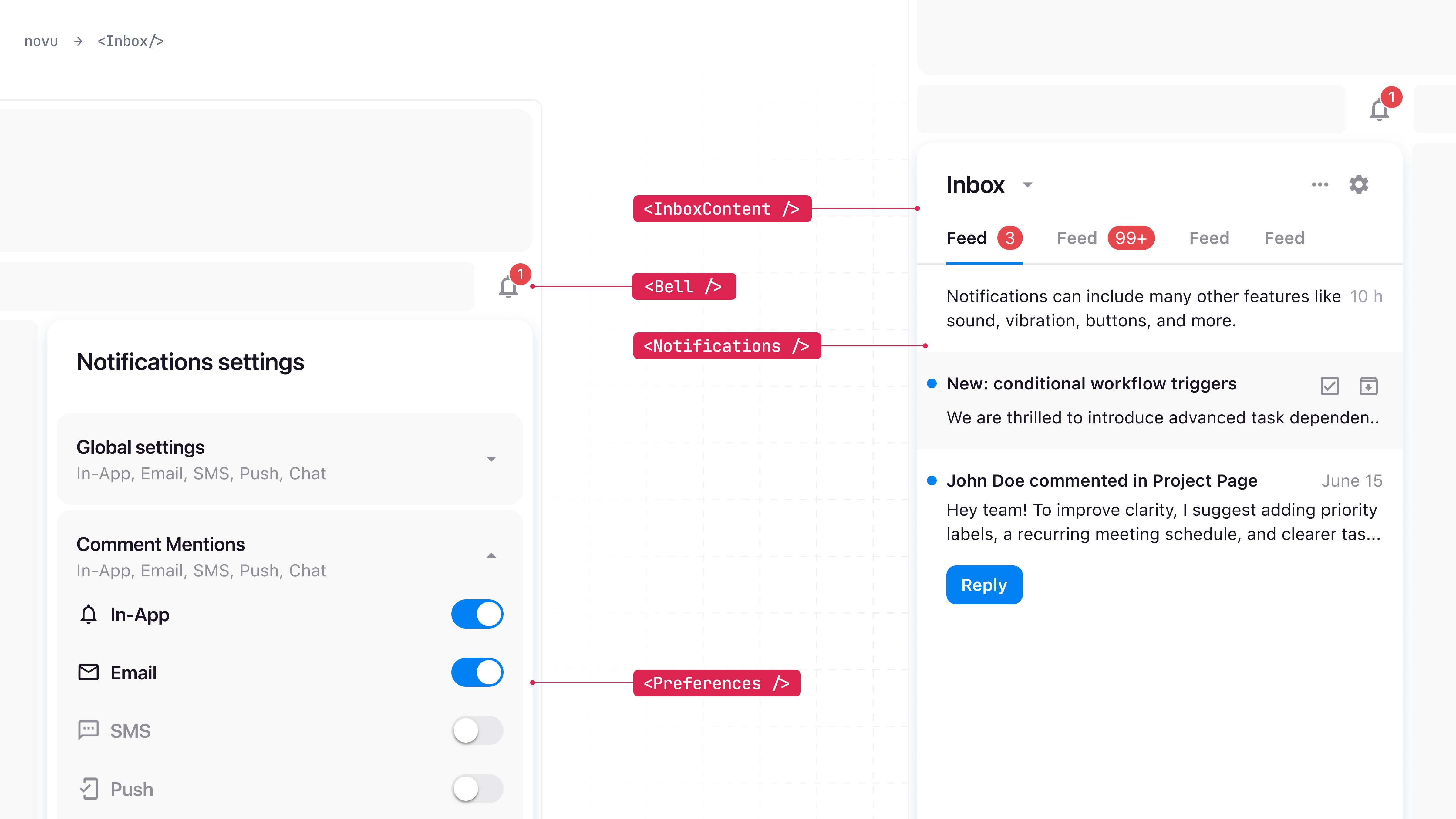
The Inbox is composed of the following sub-components that you can use to build your Inbox structure and layout:- <Inbox /> - The Inbox wrapper, which is used to wrap the entire inbox UI and establish the session.
- <Bell /> - Used to display the bell icon and trigger the popover component when clicked.
- <Notifications /> - Displays the notifications list.
- <Preferences /> - Used to display the preferences modal.
- <InboxContent /> - Usage with a custom popover.
appearance prop.
Layouts
The composition of the indivudal components can generate multiple different popular inbox layouts.Inbox with Bell (Default)
A trigger button usually located at the top right corner of the screen, which triggers the popover component when clicked.Side menu Inbox
To render a side menu inbox, use the<Notifications /> component as a direct child of the <Inbox /> component, you can hide or show it based on any custom logic.
Full page Inbox
Similiary to the side menu inbox, you can use the<Notifications /> component as a direct child of the <Inbox /> component, you can hide or show it based on any custom logic.